Douangtavanh Kongphaly

Douangtavanh Kongphaly

Intro in less than 150 words

Hi there! 👋 I'm a data analyst who codes, visualizes and does statistically stuff on complex issues. Recently, I was a consultant for the United Nations Office for Disaster Risk Reduction (UNDRR) in the National Early Warning System Perception Survey. Before that, I worked for the World Health Organization Lao PDR as a COVID-19 vaccine data officer for the Vaccine-Preventable Diseases and Immunisation department. Apart from my full-time stuff, I am incredibly enthusiastic about technology. By nature, I love exploring, learning new stuff, and sharing it with others. 👉 You can find out what I've written so far by visiting this blog. Also, I've been interested in data and visualisation. Please check it out either on GitHub or Observable.

Here are some of my projects:

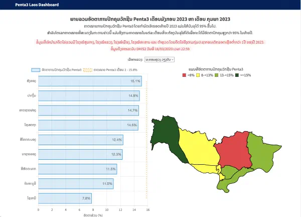
This dashboard was designed to simplify the tracking of Penta 3 vaccination progress in Lao PDR. It allows healthcare workers at all levels to monitor progress by province and district, and compare it to monthly targets. This information is essential to achieving the national goal of 95% Penta 3 vaccination by the end of the year.


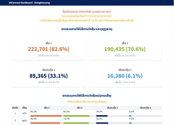
The dashboard was created to monitor the daily progress of the CONNECT project's COVID-19 vaccination efforts in Xiengkhauang province in preparation for the national sports games. Its main objective was to allow project coordinators, provincial and district leaders, and healthcare workers to track and respond to vaccination rates in their respective areas. By displaying key metrics, including daily vaccination numbers, average vaccinations, and percentage increases from the baseline, the dashboard enabled supervisors to evaluate performance and make data-driven decisions. Although the inclusion of numerous metrics resulted in comprehensive visualizations, it also led to complex graphics. To address this, a guideline on how to interpret the graphics was provided to ensure that users at all levels could understand the key messages from the charts.


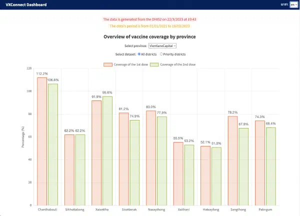
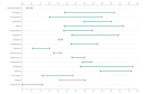
The dashboard, initially created to track COVID-19 vaccination progress and updated weekly, was designed to help CONNECT project staff and other stakeholders who lack direct DHIS2 data access. Although it originally displayed only the 20 districts with the lowest vaccination rates, it was expanded to include all districts. The primary challenge in designing the dashboard was displaying large amounts of data without causing slowdowns or freezing. Pre-built chart visualization tools like Looker and Tableau couldn't handle the data filtering requirements. To address this, the dashboard was built using Chart.JS (an open-source JavaScript library for data visualization), D3.JS (an open-source JavaScript visualization library), and Svelte (an open-source web framework). The result is a fast and flexible dashboard that allows for efficient data filtering over specific time periods.


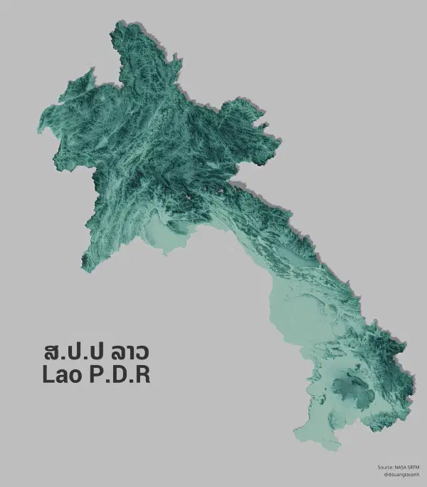
A 3D map with an aesthetic colour selection was created to highlight the terrain level. QGIS and Blender, both open-source graphic software, were used to process NASA's topographic data (SRTM) and generate the 3D visualization.


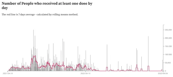
At the start of the COVID-19 outbreak in Lao PDR, the CCEH published daily vaccination updates on their MOH Facebook page. To create a public data source, I collected this data from the CCEH FB page and shared it on my GitHub. I also created various graphs to track vaccination progress.


Multidimensional poverty encompasses various deprivations experienced by the poor in their daily lives by capturing the non-monetary dimensions of well-being (consumption, education, and living standards) alongside the monetary measure.


Using the latest data of The Lao Expenditure and Consumption Survey (LECS6) and LECS 5 to show poverty differences by headcount on a map.


The visualisation shows the tracing of the first exposure to COVID-19 in Lao PDR, dated back to April 2020.


The first dashboard of the project and an important project milestone, the NIPN dashboard was designed to allow policymakers to track health indicators, especially those related to nutrition. It features interactive visualizations and includes indicators from many sectors and sources relevant to nutrition, including health, education, agriculture, and surveys.


Using the Action on Google API to create a visual game master for the Avalong board game.